Mahima | Lead Product Designer
Case 01 · Government · Enterprise · Systems Design · 2023 — 2025
20 years of patchwork, replaced with a system built to adapt
A national trade certification platform, rebuilt for the exporters who needed speed and the government that needed control.
ROLE
Lead UX Designer, leading three designers
CLIENT
Govt of a developed Island Nation
AT A GLANCE
01 · The situation
02 · Scope
03 · The work
04 · What shifted
$33B export sector. Five legacy systems from the 1990s. Post-COVID compliance volatility.
61 interviews · 10 testing rounds · 18 prototypes · 900+ screens · team of three.
Wine and plant releases live. Animal products in build. The framework was adopted for adjacent internal systems.
Five legacy commodity tools, replaced with one workflow tool for exporters and one configuration tool for government officials.
01
The situation
A $33B export economy ran on systems built in the 1990s.
Five tools, one task.
One tool per commodity — animal, plant, wine, organics, free sale certificates. Together they handled paperwork for every shipment leaving the country.
Until the rules changed.
Post-COVID, importing countries began shifting compliance requirements with weeks of notice. Rules were hard-coded. Each change required a developer release on a fragile codebase. Shipments started docking abroad with paperwork that no longer matched the rules.
02
The user groups
Exporters and the government needed opposite things from the same system.
Speed for one side.
Exporters wanted speed: faster issuance, fewer manual steps, fixes available outside government hours.
Defensibility for the other.
The government needed regulatory defensibility — audit trails, validation, and rules that could change without breaking shipments already in flight. The legacy tools served neither well.
“With border inspectors, if the information on paper is not looking correct, it’s fraud."
An SME, early discovery
USER PROFILES - The exporter side of the system actually served six distinct roles
Four exporter types and two adjacent stakeholders. Each had a different rhythm, tolerance for friction, and definition of "done.

03
The findings
The user journeys pointed at the policy layer, not the UI.
Unifying th UI wasn't enough
Merging five tools into one still leaves rules hard-coded. The UI the brief asked for wouldn't survive its first rule change.
The expansion
The reframe took several rounds of journeys, prototypes, research insights, proposals before the scope expanded.
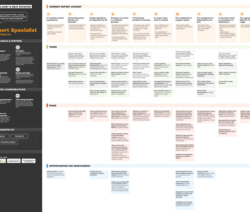
USER JOURNEY MAPS - 1 of 7 that helped us understand the real problems
Channels, tasks, pains, and opportunities — mapped per persona across the full certification flow.
Where rules live.
The configuration tool — used by government officials to define rules, fields, and amendment criteria. Rule changes stopped being engineering projects. Officials update trade rules themselves, without developers, without a release cycle.
Where work happens.
The workflow tool — used by exporters to file. Its behavior is set by whatever the configuration publishes: forms, validations, amendment rules, entry modes.
04
The plan
Blueprinting the plan
Multi workflow, parallel design
Five commodity workflows in parallel. Alignment had to live somewhere the whole team could read.
The anchor for everything downstream.
Signed off by the client before screen design or wireframing began. Source of truth for handovers, onboarding, and every conversation about what got built.
PRODUCT BLUEPRINT - 1 of 5 bluepritns prepared
User journey, features, tasks, screen flow — one reference the whole team
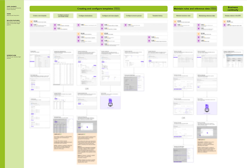
User Journey
Related Features
Tasks
Screen Flow
Complexities
05
The action
The principles and primary problems
Universal usability
Every pattern had to work for the least-experienced user — seasonal workers, older officials, varying digital fluency. WCAG-compliant by default; short sentences, plain language, minimal cognitive load.
Legal confidence
For a system where incorrect paperwork is legally fraud, user uncertainty isn't a UX concern — it's a shipment held at port. Explicit confirmations, visible state, friction before any irreversible action.
The two pulled opposite ways: usability wants fewer clicks; legal confidence wants more confirmations. The responses below are the patterns that did both.
Beyond the obvious problems of consolidation and manual coordination, research surfaced five pressing issues that ran across users' journeys.
01
PROBLEM
Amendments as bottlenecks
Exporters had to rely on the government for routine corrections, which delayed their certificates
02
PROBLEM
Retraining of seasonal staff
Peak users were seasonal staff with no institutional memory the legacy tools relied on
03
PROBLEM
One workflow, very different operating tempos
Although the process was similar the tasks were different at certain stages
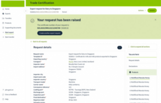
Screens designed and tested


06
Reflection
What I'd do differently
System fragility audit in discovery
The legacy system was more fragile than anyone realized until engineering started touching it. Simple changes cascaded unpredictably. That fragility wasn't priced into the timeline, and became the biggest pressure point on the project.
Solve for all export groups together
Animal products needed minor flows that weren't in wine or plant. Designing all five commodities in parallel rather than sequentially would have surfaced those gaps earlier.